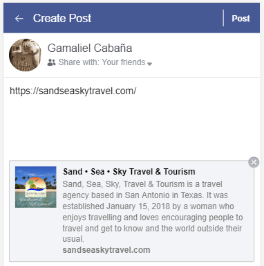
Perhaps, the most frustrating thing in designing websites is getting that consistent design across all platforms. I have recently felt this when I was setting up an Open Graph image on a client’s website (https://sandseaskytravel.com — check it out and let me know what you think 🙂 ).
If you do not know what Open Graph is, it was created by Facebook to allow integration between Facebook and a website. You can set which elements on your website you want to show when someone shares your website. Simply put, what this does is, when you share a website on Facebook, you get a website preview right? The more it looks good or the more the image is visible or relevant to the post, there’s a bigger likelihood that you’ll click on it. This is why, this is important—making that good impression.
If you’re a bit technical and want to read more, go to http://ogp.me/.
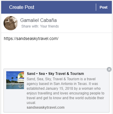
Here’s the problem..
According to Facebook, we have to use images that are (link to the article here. Number 3):
- At least 1200 x 630 pixels for best display on high resolution devices
- 600 x 315 pixels for link page posts.
- Minimum 200 x 200 pixels.
So what I did was created an image as what they have specified and voila! I checked it and looked good on desktop!
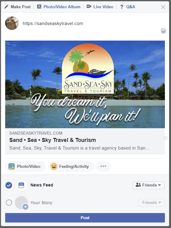
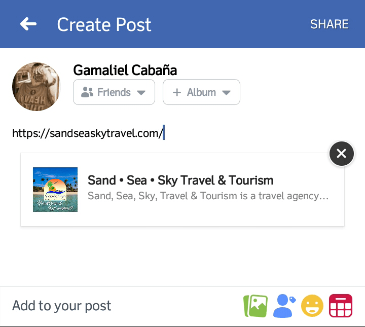
Tried on mobile since its recommended to design with mobile first in mind but it looked wonky. It was cropped square and cut out the text I wanted to display. Not good.
Back to the drawing board
With Facebook behaving differently on mobile, I had to find what the problem is and consider
- Where was the image cropped?
- What do I want for the viewers to focus on?
- What can I drop on my design?
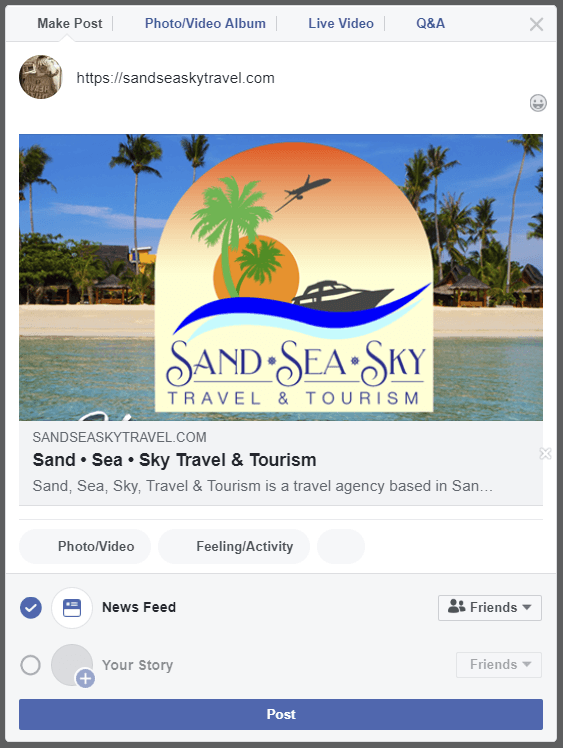
After laying out the things I noticed, I knew I had to let go or move my text since and make the company logo the centerpiece. Facebook is cutting off the text and can’t be read since it’s becomes tiny on mobile anyway.
Also, the logo is more important as it is represents the company and should be distinguishable even if it’s small. So, I thought I should try a square layout using the recommended maximum size. I won’t grab the credit here, because while I was checking out in Google if my hunch was right, I saw this post by Nick Vogt to confirm it. And he did.
Final output
So, I did what he said, I made a 1200 x 1200 pixel image and what do you know? I had Facebook scrape the site and that did it! Now, it looks good on both mobile and desktop!
Other than the image size, there are three more things to consider:
- The image does not need to have a high resolution so it won’t eat your visitor’s bandwidth. Somewhere between 72 to 90 pixels/inch would be fine.
- It would be best if the image is saved as a lossless PNG so you would not get the artifacts you get when the image is saved as a JPEG.
I made a PSD template to make working with Open Graph images in the future a lot easier and I’m willing to share it for free. Just provide your details and I’ll email it to you!
After reading this, I know this sounds like a lot of hard work when you have to take care of your business, so why not contact us and we’ll do the elbow grease for you!